avatar

Ant Design Form 组件总结 结合Modal 自定义Modal的实现 (Upload Input Select DatePicker Cascader)

起源

最近在项目中发现要写多个弹框(用于查看、编辑、新建XX信息),如下图。

测试图片

像这样花里胡哨的弹框在一个大型的中台管理系统中,可能要写上好几遍的Modal
但是其实他们大同小异。

首先,他们的title是固定的(增、改、查)

底下的内容也是固定的,无非就是Upload Input Select DatePicker Cascader

(写不了<>。其实应该是ant design 的组件)

改进

所以我想自己写一个ModalView的组件。只需要传入这上面的数据类型,title之类的数据就可以完成渲染。

如下,这个是我项目中的一个例子

1
2
3
4
5
6
7
8
<ModalView 
onOk={this.edit} // 点击Modal确定时的回调
onCancel={this.hideModal} // 点击Modal取消,或者点击mask时的回调
show={visible} // Modal的显隐
category={category} // Modal的title,通过category来判断(目前只有查看、编辑、新增)
data={fStaffManage} // 自定义Modal的核心,整个Modal的渲染
showData={showData} // 点击查看和编辑时的默认数据
/>

接下来是fStaffManage的数据结构

1
2
3
4
5
6
7
8
9
10
11
12
13
14
15
16
17
18
19
20
21
22
23
24
25
26
27
28
29
30
31
32
33
34
35
36
37
38
39
40
41
42
export const fStaffManage = [
{
label: '员工编号(自动生成)',
key: 'id',
type: 'input',
Message: '请输入员工编号',
disabled: true,
},
{
label: '门店',
key: 'storeNo',
type: 'select',
Message: '请选择门店',
option: [],
},
{
label: '员工姓名',
key: 'userName',
type: 'input',
Message: '请输入员工姓名',
},
{
label: '角色类型',
key: 'roleCodes',
type: 'select',
Message: '请选择角色类型',
option: [{ severKey: '店员', showValue: '店员' }, { severKey: '店长', showValue: '店长' }],
},
{
label: '联系电话',
key: 'mobile',
type: 'input',
Message: '请输入联系电话',
pattern: '^1[34578]\\d{9}$',
},
{
label: '测试上传图片',
key: 'testImgUpload',
type: 'imageUpload',
Message: '请上传图片',
},
];

Message 是用于Form表单的提示用于以及placeholder

label 是用于Form的label

key 是用于map循环时的key(防止warning和提升效率)

type 是用于显示那种类型的组件

pattern 是用于Form表单检测的正则表达式

1
2
3
4
5
6
7
8
9
10
11
12
13
14
15
16
17
18
19
20
21
22
23
24
25
26
27
28
29
30
31
32
33
34
35
36
37
38
39
40
41
42
43
44
45
46
47
48
49
50
51
52
53
54
55
56
57
58
59
60
61
62
63
64
65
66
67
68
69
70
71
72
73
74
75
76
77
78
79
80
81
82
83
84
85
86
87
88
89
90
91
92
93
94
95
96
97
98
99
100
101
102
103
104
105
106
107
108
109
110
111
112
113
114
115
116
117
118
119
120
121
122
123
124
125
126
127
128
129
130
131
132
133
134
135
136
137
138
139
140
141
142
143
144
145
146
147
148
149
150
151
152
153
154
155
156
157
158
159
160
161
162
163
164
165
166
167
168
169
170
171
172
173
174
175
176
177
178
179
180
181
182
183
184
185
186
187
188
189
190
191
192
193
194
195
196
197
198
199
200
201
/*
* @Author: Derrick
* @Date: 2019-04-04 16:53:05
* @Last Modified by: Derrick
* @Last Modified time: 2019-04-28 15:48:04
*/
import React, { PureComponent } from 'react';
import { Modal, Form, Button, Table, Upload, message, Row, Select } from 'antd';
import { connect } from 'dva';
import PropTypes from 'prop-types';
import componentAuth from '@/common/ComponentAuth';
import FormSelect from '@/common/FormItems/FormSelect';
import FormInput from '@/common/FormItems/FormInput';
import FormDataPicker from '@/common/FormItems/FormDataPicker';
import FormCascader from '@/common/FormItems/FormCascader';
import FormTextArea from '@/common/FormItems/FormTextArea';
import FormImageUpload from '@/common/FormItems/FormImageUpload';
import { HEADER_BASE, SEVER_URL_BASE } from '@/utils/constant';
import Col from 'antd/es/col';

const formItemLayout = {
labelCol: {
xs: { span: 24 },
sm: { span: 5 },
},
wrapperCol: {
xs: { span: 24 },
sm: { span: 16 },
},
};
const { Item } = Form;
const { Option } = Select;

@connect(({ mIdentifyCenter }) => ({
mIdentifyCenter
}))
class ModalView extends PureComponent {
state = {
data: [],
storeId: '',
};

// 返回title
caseCategory = category => {
switch (category) {
case 'check':
return { title: '查看' };
case 'import':
return { title: '导入', import: true };
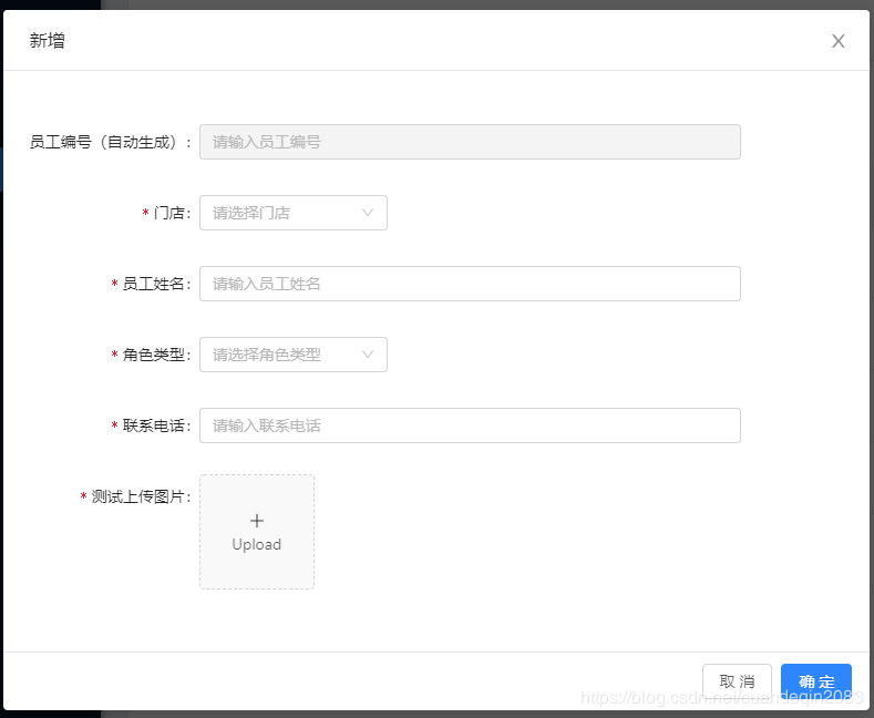
case 'create':
return { title: '新增' };
case 'edit':
return { title: '编辑' };
default:
return { title: '查看' };
}
};

showLabel = (type, label) => {
const { category } = this.props;

if (category === 'search') {
if (type !== 'datePicker') {
return undefined;
}
return label;
}
return label;
};

showRequire = disabled => {
const { category } = this.props;
if (category === 'search') {
return false;
}
if (disabled) {
return false;
}
return true;
};

form = () => {
const {
form: { getFieldDecorator },
data,
showData,
category,
} = this.props;

let ShowType;

return data.map(value => {
const { label, key, type, Message, option, disabled, pattern } = value;
if (!value) {
return null;
}
switch (type) {
case 'input':
ShowType = FormInput;
break;
case 'select':
ShowType = FormSelect;
break;
case 'datePicker':
ShowType = FormDataPicker;
break;
case 'cascader':
ShowType = FormCascader;
showData.region = [showData.provinceId, showData.cityId, showData.countyId];
break;
case 'textArea':
ShowType = FormTextArea;
break;
case 'imageUpload':
ShowType = FormImageUpload;
break;
default:
ShowType = null;
}
return (
<Item label={this.showLabel(type, label)} key={key}>
{getFieldDecorator(key, {
rules: [
{
required: this.showRequire(disabled),
message: Message,
pattern: pattern || undefined,
type: type === 'cascader' ? 'array' : 'string',
},
],
initialValue: showData[key] ? showData[key] : undefined,
})(
<ShowType
option={option}
message={Message}
disabled={!!(disabled || category === 'check')}
/>
)}
</Item>
);
});
};

checkOk = () => {
const { onOk, form } = this.props;
form.validateFields((err, fieldsValue) => {
if (!err) {
onOk(fieldsValue);
}
});
};

closeModal = () => {
const { onCancel, form: { resetFields } } = this.props;
resetFields();
onCancel();
}

render() {
const { data } = this.state;
const { show, category = '', importColums, downloadUrl } = this.props;
const modalData = this.caseCategory(category);
return (
<Modal
visible={show}
onCancel={this.closeModal}
onOk={category === 'import' ? this.importOk : this.checkOk}
title={modalData.title}
width="70%"
footer={modalData.title === '查看' ? null : undefined}
>
<Form style={{ paddingTop: '20px' }} {...formItemLayout}>
{this.form()}
</Form>
</Modal>
);
}
}

ModalView.propTypes = {
onOk: PropTypes.func.isRequired, // 弹框点击确定
onCancel: PropTypes.func.isRequired, // 隐藏弹框
show: PropTypes.bool, // 是否显示弹窗
category: PropTypes.string, // 弹框的类型(title显示
data: PropTypes.arrayOf(PropTypes.object).isRequired, // 数据类型; 位置:'@/common/constant/sormView.js' 记得写注释; 格式: `s${文件名}`
showData: PropTypes.object, // 查看或者编辑时的默认数据
importCallBack: PropTypes.func, // 导入之后,点击确定的回调函数
importColums: PropTypes.array, // 导入时候显示表格的表头
downloadUrl: PropTypes.string, // 下载的模板的文件名
};

ModalView.defaultProps = {
show: false,
category: 'check',
showData: {},
importCallBack: () => {},
importColums: [],
downloadUrl: '',
};

export default Form.create()(ModalView);
  • FormCascader
1
2
3
4
5
6
7
8
9
10
11
12
13
14
15
16
17
18
19
20
21
22
23
24
25
26
27
28
29
30
31
32
33
34
35
36
37
/*
* @Author: Derrick
* @Date: 2019-04-11 09:57:54
* @Last Modified by: Derrick
* @Last Modified time: 2019-04-28 16:52:57
*/
import React, { Component } from 'react';
import { Cascader } from 'antd';
import PropTypes from 'prop-types';
import regionData from '@/constant/regionData'

class FormCascader extends Component {

change = (e) => {
const {onChange} = this.props;
onChange(e)
}

render() {
const {value, disabled, message} = this.props;
return (
<Cascader placeholder={message} options={regionData} disabled={disabled} value={value} onChange={this.change} />
);
}
}

FormCascader.propsType = {
disabled: PropTypes.bool, // 是否不可选
message: PropTypes.string, // 默认文字(placeholder
}

FormCascader.defalutProps = {
disabled: false,
message: '',
}

export default FormCascader;
  • FormDataPicker
1
2
3
4
5
6
7
8
9
10
11
12
13
14
15
16
17
18
19
20
21
22
23
24
25
26
27
28
29
30
31
32
33
34
/*
* @Author: Derrick
* @Date: 2019-04-10 10:57:08
* @Last Modified by: Derrick
* @Last Modified time: 2019-04-15 14:28:40
*/
import React, { Component } from 'react';
import PropTypes from 'prop-types';
import { DatePicker } from 'antd';

class FormDataPicker extends Component {

change = (e) => {
const {onChange} = this.props
onChange(e)
}

render() {
const {value, disabled} = this.props;
return (
<DatePicker disabled={disabled} value={value} onChange={this.change} />
);
}
}

FormDataPicker.propsType = {
disabled: PropTypes.bool, // 是否不可选
}

FormDataPicker.defalutProps = {
disabled: false,
}

export default FormDataPicker;
  • FormImageUpload
1
2
3
4
5
6
7
8
9
10
11
12
13
14
15
16
17
18
19
20
21
22
23
24
25
26
27
28
29
30
31
32
33
34
35
36
37
38
39
40
41
42
43
44
45
46
47
48
49
50
51
52
53
54
55
56
57
58
59
60
61
62
63
64
65
66
67
68
69
70
71
72
73
74
75
76
77
78
79
80
81
/*
* @Author: Derrick
* @Date: 2019-04-26 14:20:20
* @Last Modified by: Derrick
* @Last Modified time: 2019-04-28 18:11:44
*/
import React, { PureComponent } from 'react';
import { Upload, Icon, message } from 'antd';
import { PICTURE_UPLOAD, HEADER_BASE } from '@/utils/constant';

class FormImageUpload extends PureComponent {

state = {
loading: false,
};

uploadButton = () => {
const { loading } = this.state;
return (
<div>
<Icon type={loading ? 'loading' : 'plus'} />
<div className="ant-upload-text">Upload</div>
</div>
)
}

handleChange = (info) => {
if (info.file.status === 'uploading') {
this.setState({ loading: true });
return;
}
if (info.file.status === 'done') {
const {onChange} = this.props
this.setState({imageUrl: info.file.response.data[0], loading: false,})
onChange(info.file.response.data[0])
}
}

beforeUpload = (file) => {
const isJPG = file.type === 'image/jpeg';
if (!isJPG) {
message.error('只能上传JPG的图片!');
}
const isLt2M = file.size / 1024 / 1024 < 2;
if (!isLt2M) {
message.error('图片大小不能大于2MB!');
}
return isJPG && isLt2M;
}

upLoadProps = () => {
HEADER_BASE.user_id = window.sessionStorage.getItem('userId');
HEADER_BASE.token_id = window.sessionStorage.getItem('tokenId');
const props = {
name: 'file',
action: PICTURE_UPLOAD,
headers: HEADER_BASE,
onChange: this.handleChange,
showUploadList: false,
beforeUpload: this.beforeUpload,
};
return props;
};

render() {

const { imageUrl } = this.state;

return (
<Upload
listType="picture-card"
{...this.upLoadProps()}

>
{imageUrl ? <img src={imageUrl} alt="avatar" /> : this.uploadButton()}
</Upload>
)
}
}

export default FormImageUpload;
  • FormInput
1
2
3
4
5
6
7
8
9
10
11
12
13
14
15
16
17
18
19
20
21
22
23
24
25
26
27
28
29
30
31
32
33
34
35
36
/*
* @Author: Derrick
* @Date: 2019-04-10 10:57:08
* @Last Modified by: Derrick
* @Last Modified time: 2019-04-15 14:46:23
*/
import React, { Component } from 'react';
import { Input } from 'antd';
import PropTypes from 'prop-types';

class FormInput extends Component {

change = (e) => {
const {onChange} = this.props;
onChange(e)
}

render() {
const {message, value, disabled} = this.props;
return (
<Input disabled={disabled} placeholder={message} value={value} onChange={this.change} />
);
}
}

FormInput.propsType = {
disabled: PropTypes.bool, // 是否不可选
message: PropTypes.string, // 默认文字(placeholder
}

FormInput.defalutProps = {
disabled: false,
message: '',
}

export default FormInput;
  • FormSelect
1
2
3
4
5
6
7
8
9
10
11
12
13
14
15
16
17
18
19
20
21
22
23
24
25
26
27
28
29
30
31
32
33
34
35
36
37
38
39
40
41
42
43
44
45
46
47
48
49
/*
* @Author: Derrick
* @Date: 2019-04-10 10:13:58
* @Last Modified by: Derrick
* @Last Modified time: 2019-04-28 15:59:22
*/
import React, { Component } from 'react';
import { Select } from 'antd';
import PropTypes, { object } from 'prop-types';

const { Option } = Select;
class FormSelect extends Component {

option = () => {
const {option = []} = this.props;
return option.map((v) => {
const {showValue, severKey} = v;
return <Option value={severKey} key={severKey}>{showValue}</Option>
})
}

selectCurrency = (e) => {
const {onChange} = this.props
onChange(e)
}

render() {
const {message, value, disabled} = this.props;
return (
<Select disabled={disabled} value={value} placeholder={message} style={{width: '170px'}} onSelect={this.selectCurrency}>
{this.option()}
</Select>
);
}
}

FormSelect.propsType = {
disabled: PropTypes.bool, // 是否不可选
message: PropTypes.string, // 默认文字(placeholder
option: PropTypes.arrayOf(object), // 选择框的选项
}

FormSelect.defalutProps = {
disabled: false,
message: '',
option: [],
}

export default FormSelect;
  • FormTextArea
1
2
3
4
5
6
7
8
9
10
11
12
13
14
15
16
17
18
19
20
21
22
23
24
25
26
27
28
29
30
31
32
33
34
35
36
37
/*
* @Author: Derrick
* @Date: 2019-04-23 10:20:36
* @Last Modified by: Derrick
* @Last Modified time: 2019-04-23 10:21:33
*/
import React, { Component } from 'react';
import { Input } from 'antd';
import PropTypes from 'prop-types';

const { TextArea } = Input;
class FormTextArea extends Component {

change = (e) => {
const {onChange} = this.props;
onChange(e)
}

render() {
const {message, value, disabled} = this.props;
return (
<TextArea rows={4} disabled={disabled} placeholder={message} value={value} onChange={this.change} />
);
}
}

FormTextArea.propsType = {
disabled: PropTypes.bool, // 是否不可选
message: PropTypes.string, // 默认文字(placeholder
}

FormTextArea.defalutProps = {
disabled: false,
message: '',
}

export default FormTextArea;

核心

1
2
const {onChange} = this.props;
onChange(XX)

这个onChange是可以直接改变FormItem的值。

接下来可以加入您自己喜欢的组件,都是大同小异,基本上都离不开这个onChange。

以上就是本人最近封装的一个组件,我感觉很好用所以想分享出来。

文章作者: Derrick
文章链接: http://derricktel.github.io/2019/06/19/ant-design-Form-%E7%BB%84%E4%BB%B6%E6%80%BB%E7%BB%93-%E7%BB%93%E5%90%88Modal-%E8%87%AA%E5%AE%9A%E4%B9%89Modal%E7%9A%84%E5%AE%9E%E7%8E%B0-%EF%BC%88Upload-Input-Select-DatePicker-Cascader%EF%BC%89/
版权声明: 本博客所有文章除特别声明外,均采用 CC BY-NC-SA 4.0 许可协议。转载请注明来自 Derrick
打赏
  • 微信
    微信
  • 支付寶
    支付寶